Path with Art Visual Style Guide
Context
This is a branding and visual design project for the Seattle-based non-profit Path with Art.
(May, 2020)
Mediums
iOS App
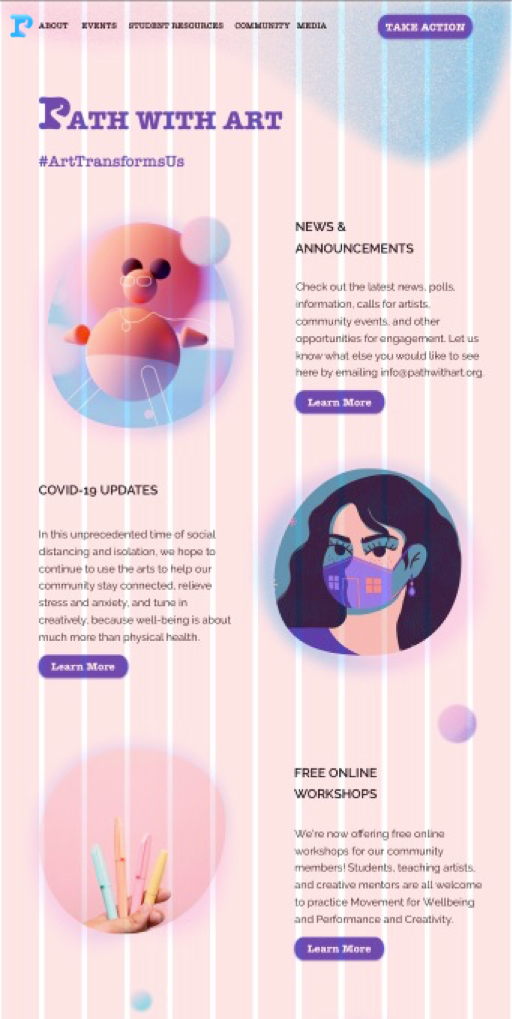
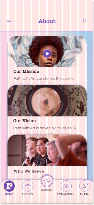
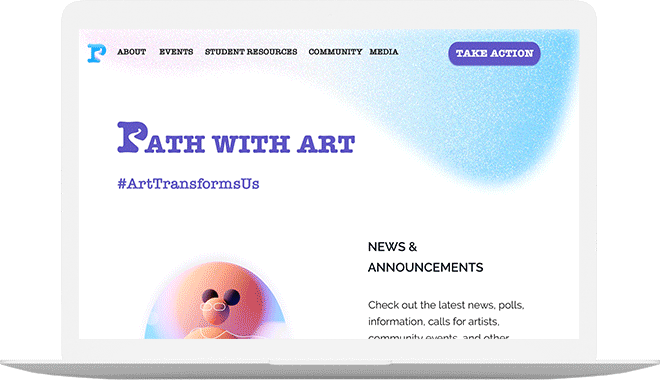
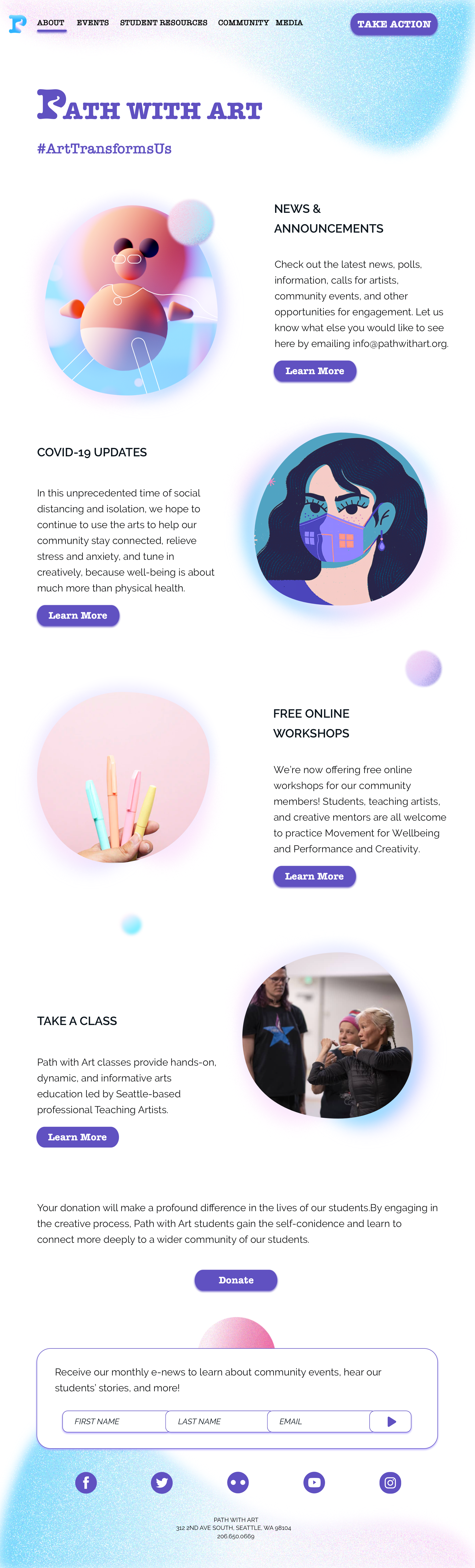
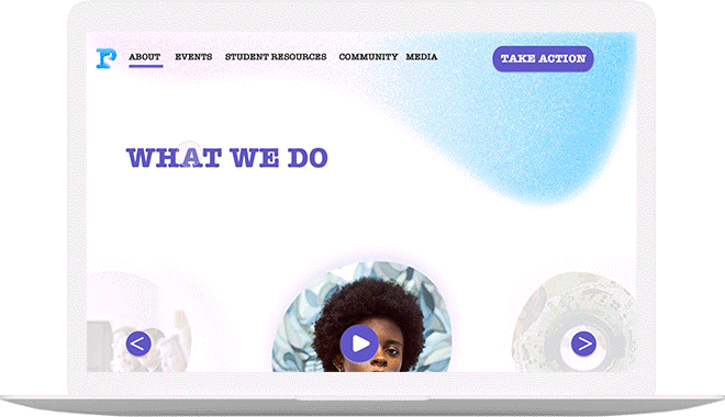
Website
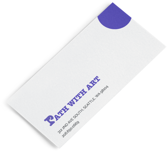
Business Cards
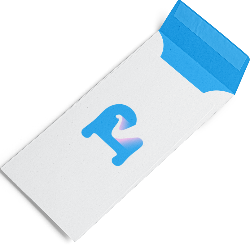
Envelope
Role (Solo)
Designer
01 Introduction
Brand Background
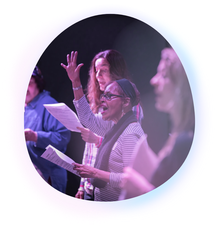
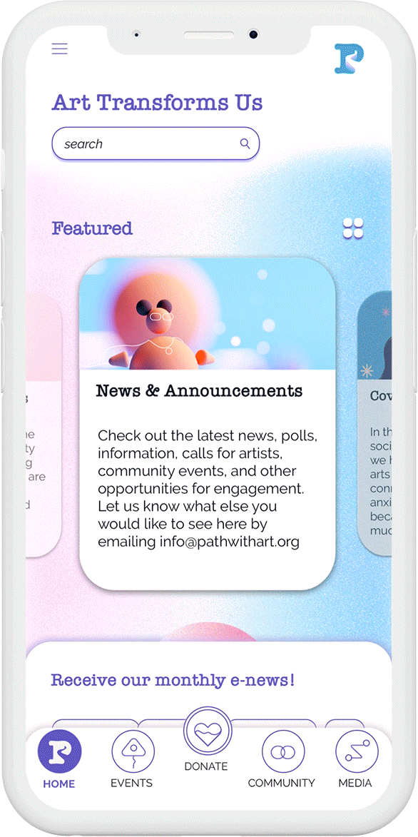
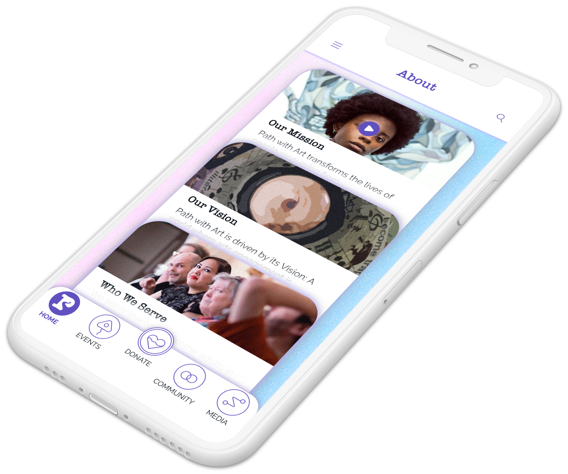
Path with Art is a Seattle-based non-profit that transforms the lives of people recovering from homelessness, addiction, and other trauma by harnessing the power of art therapy as a path to individual stability, community building, and social engagement.
Communication Goals
The goals of this visual style guide are to highlight the transformative energy of creative endeavors, the fluid sense of self one discovers by walking along their path with art therapy, and the healing power of the artistic engagements.
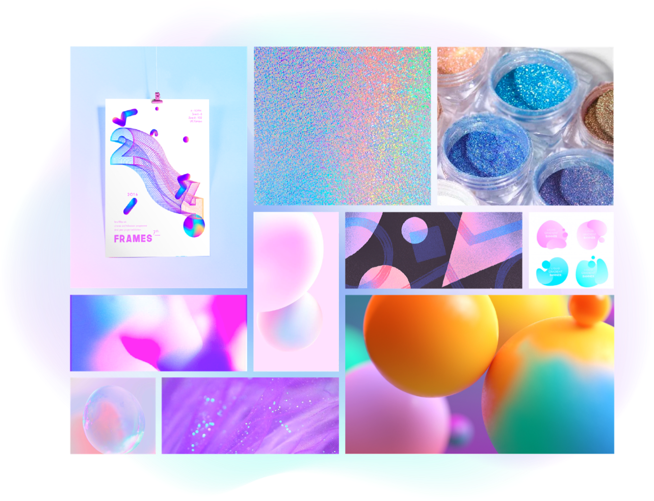
02 Moodboard
03 Color & Effect
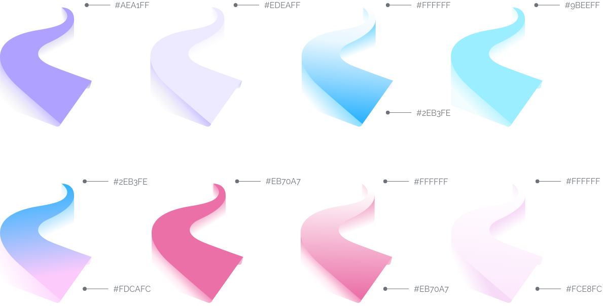
The primary colors constitute a refreshing gradient blending light azure and soft pink. The soothing quality of the two complementary colors with just enough paleness mixed in highlights the healing power of the organization. Slate blue as an accent color creates sufficient contrast between the emphasized contents and their background.
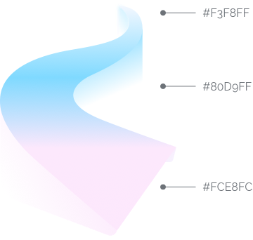
Primary colors & gradient
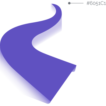
Accent color
Additional colors & gradient
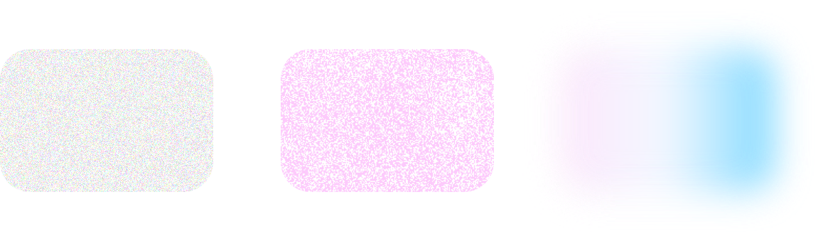
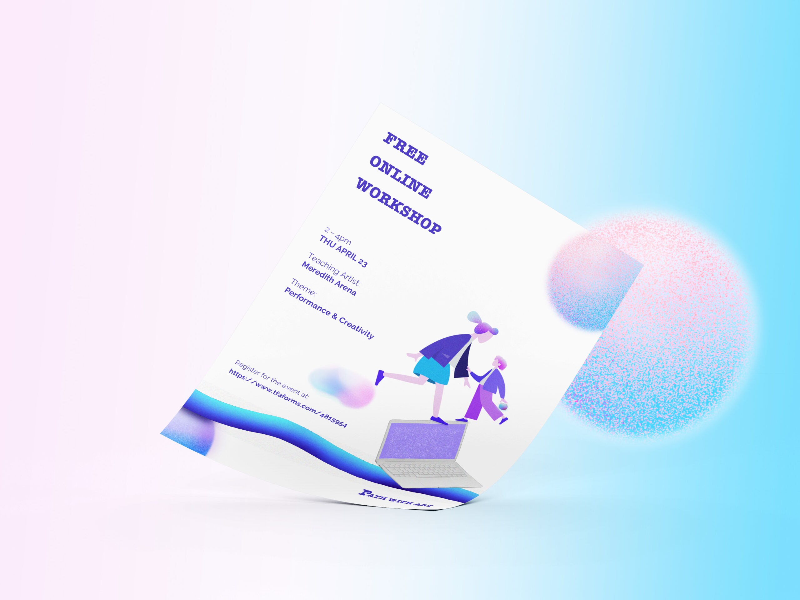
Noise and grains of various colors are applied as the texture to decorative elements to mimic glittering powder coatings and add a sense of creative novelty.
Gaussian blur is applied to the edges of decorative elements and bubble containers so as to create a hazy transition, which gives a gentle and dreamy ambience appropriate to the art brand.
Texture 1
Texture 2
Gaussian Blur: 15
04 Typography
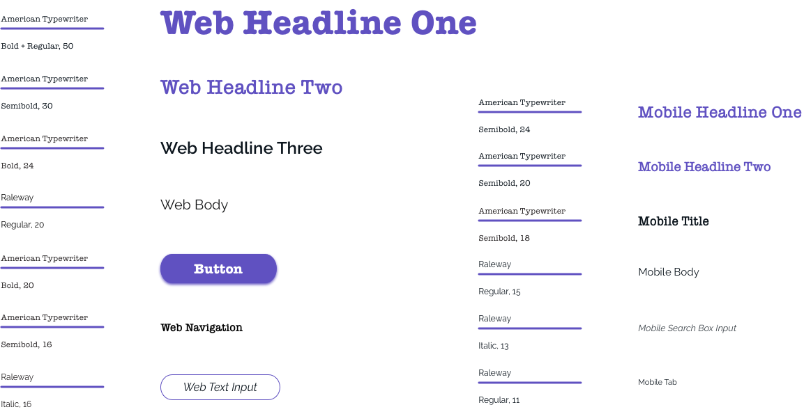
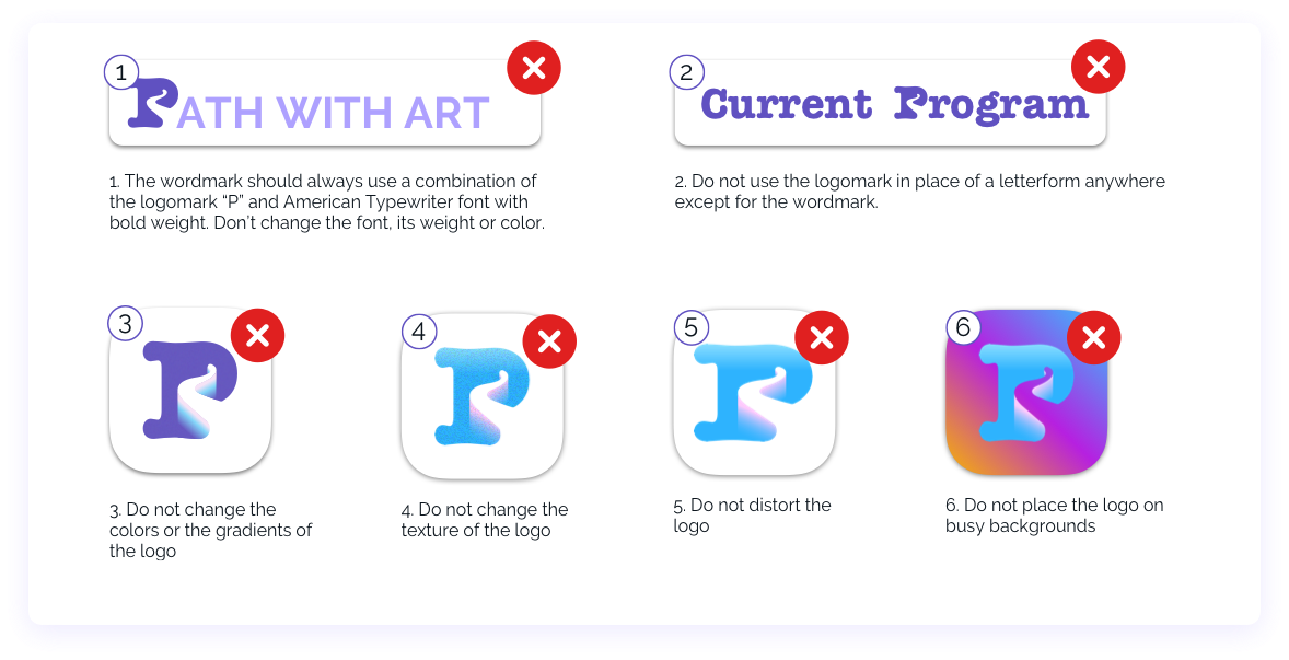
American Typewriter is a slab serif font. It boasts rounded, friendly strokes and evokes a nostalgically hand-crafted, one-on-one communication style that matches the mission of art therapy.
Raleway is an elegant sans-serif font featuring geometric aesthetics. It brings structure without losing artistic touches and displays large bodies of text in a clean and legible way.
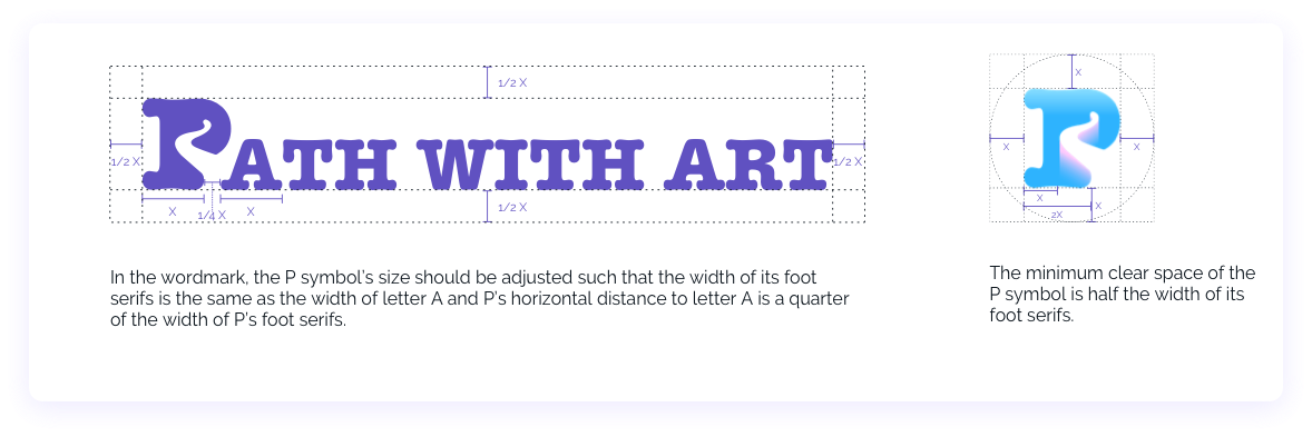
05 Logo Guidelines

06 Grid System
The web uses a 12-column layout with 70 px column width, 10 px gutter width and 5 px margins on the left and right side.
The mobile uses a 12-column layout with a column width of 26px, a gutter width of 5px and margins of 4px on the left and right side.
07 Applied Media
Selected Works
Leveraging Hololens 2 to Empower Field TechniciansMixed Reality Design; UX Design; UX Research

Datarchy 1.0 - A Design FictionSpeculative Design